/Projects
GCSE History
tl;dr GCSE History is a web platform based on the UK educational system. The project started at the beginning of 2020.
Goals and Challenges
As a very ambitious startup project, the main goal was building from the ground up 1 web app, 2 native mobile apps (iOS and Android), and 2 apps for smart assistants (for Amazon Alexa and Google Assistant).
Another big goal was the design of 44 books. After that, the next goal was using HTML and CSS, to reproduce the design and then converting it to PDF for print, to EPUB and Kindle formats. And of course, building a bookstore, as part of the web app.
And we did it for 1 year and 3-4 months. I was involved in the whole process from decision-making to the final execution (see below).
The Team
Our team consists of 2 full-stack developers (including the CEO) and me as the only designer and front-end developer.
My Responsibilities
- Competitive research
- Defining user workflows and constantly giving suggestions for improvements and optimization
- Creating wireframes and interactive prototypes
- UX/UI design for web app*
- UX/UI design for native iOS and Android apps*
- Conversational UI design for Amazon Alexa and Google Assistant apps*
- Building an entire web app layout with HTML and SASS, using Vue.js/Nuxt.js frameworks
- Building layouts for native apps with Swift and Kotlin
- Responsive design for the web app
- UI design and creating reusable UI components and patterns, like buttons, form elements, list elements (like cards), headers, modals, and others, to achieve visual consistency across different pages and speed up the development process
- Manage visual assets - images, icons
- Design of landing pages
- Collaborate with 2 full-stack developers
- Email templates - UI design and building in Send Grid (HTML and CSS)
- Graphic design for 44 print books (study guides) and converting from HTML to PDF, EPUB, and Kindle
* the UX/UI of the web app is a result of a lot of discussions (design thinking process) with the CEO/developer. Many hard decisions were made, with the only goal, the app to be easy to use, intuitive and to meet user and business needs. The result is based on teamwork.
User Personas
We have 2 main user personas. Our first target group includes students. They need to learn, practice, and test their knowledge. They have different problems which we were trying to solve. For instance, they need a simple methodology to learn and practice, well-synthesized information and they can be in various environments. The other target group was teachers. They need to create classes, add students, examine students, analyze their knowledge, strengths, and weaknesses, based on generated analytics. For example, one of the problems they have is that they spend a lot of time preparing homework and we want to simplify that process. Solving these various problems can meet user's needs and our business needs.
The process
SWOT Analysis
I initiated a SWOT analysis to find the strengths, weaknesses, mistakes, similarities, and differences between competitors in the education industry in the UK, especially in history education. Also, we asked teachers and students, what they like or don't like in the competitors' apps they use.
Implementation
The next steps depend on the complexity of the feature - it can be working on mockups, mind maps, drawing user flow, user interactions on a board, or just discussing a few possible options, see pros and cons, make an assumption, trying to think from student and teacher's perspective and finally make a decision and then implement the feature. Testing was partially included in our workflow.
Solutions
While working on UX, a lot of decisions were made. Below you can find only some of them.
Navigation
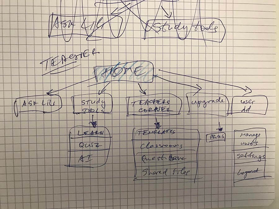
Using pen & paper is my favorite tool for thinking about information architecture and user flow. Because of the specifics of the UK educational system, there were a few challenges regarding how the user navigates to some of the features.
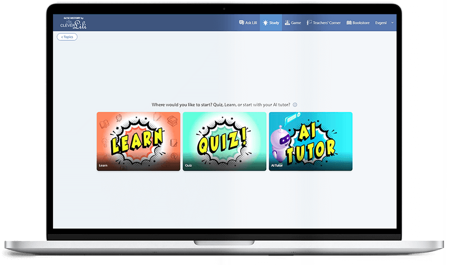
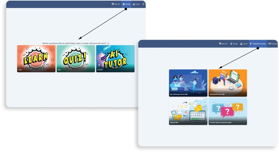
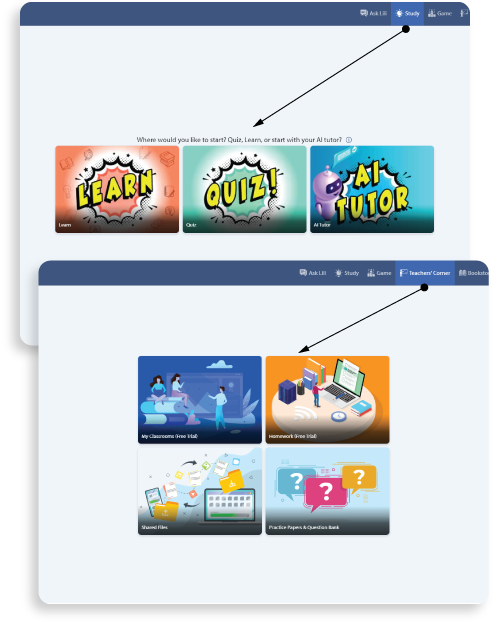
For the entire app, our approach was to create navigation broken down into a few main big sections which were visible in the main navbar. There we have added: Ask Lili (chat with a smart assistant), Study, Teachers corner (for teachers) or Homework (for students), and Bookstore. Less important features or navigation flows were added to a dropdown menu.
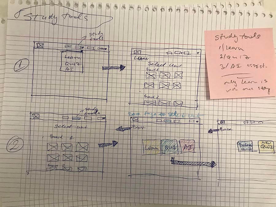
Some features have many important sub-features. If a student or a teacher clicks on Study from the main navbar, the next screen includes 3 main navigation options. If the teacher clicks on Teacher's corner from the main navbar, the next screen includes 4 extra options. This helps users to navigate without confusion.
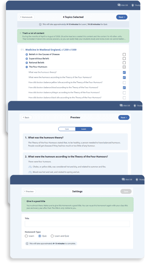
In almost every section, navigation is built like a wizard, where each screen is one step toward the goal. For instance, to create homework or assignment, every teacher needs to go through a few steps. Because the setup is very complicated, with many options and many possible selections, we made this feature use a wizard with a few steps. Instead of one complicated screen with all settings in one place, we split them.
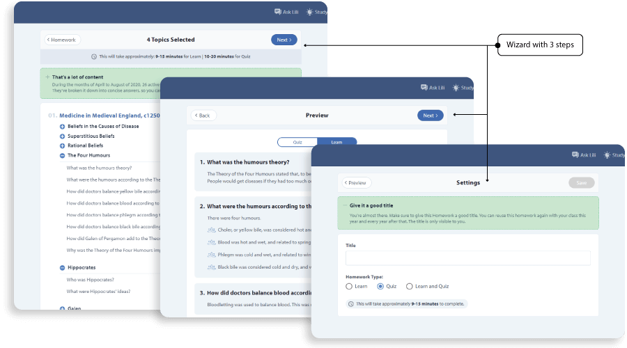
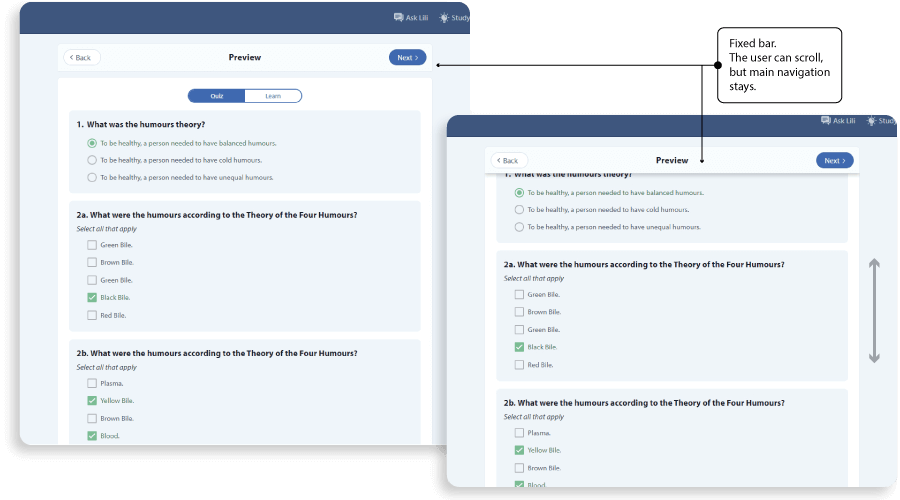
In these screens, the user can go back and forward, before he has finished and saved. We decided to have a sticky/fixed navigation bar, so if the content is long and the user has to scroll, the bar with the buttons doesn’t scroll but stays on top. The user doesn’t need to scroll back to see the Back, Next, or Save buttons.
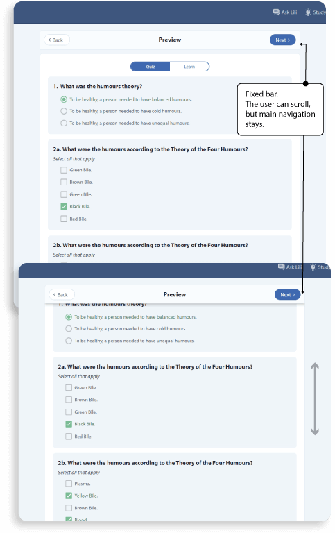
Before we release a feature, we made a few iterations, interviewed a few teachers, and tested them. After we eliminated some confusion from the first test, in the final test, they found this very easy to use. No confusion, because the teacher is focused on one important action/choice at each step.
AI assistant (mute and speed buttons)
One main difference between the GCSE History app and the competitors' apps is that we use an AI assistant in most of the features we have.
For example, if the user picks a unit to study and starts the learning process, the AI assistant will start with voice and text (karaoke style) to tell/show unit information. This is a nice feature, but at the same time can be annoying.
GCSE History persona can be a teacher or a student. This means that they can be in a different environment (public or private spaces, in school or at home, working on a notebook, or with a phone on the bus). Sometimes the user might not want to listen to the voice and only see text (karaoke), or just to listen. And this can change, based on the users' habits or the environment where the app is used. And this setting should be easily accessible.
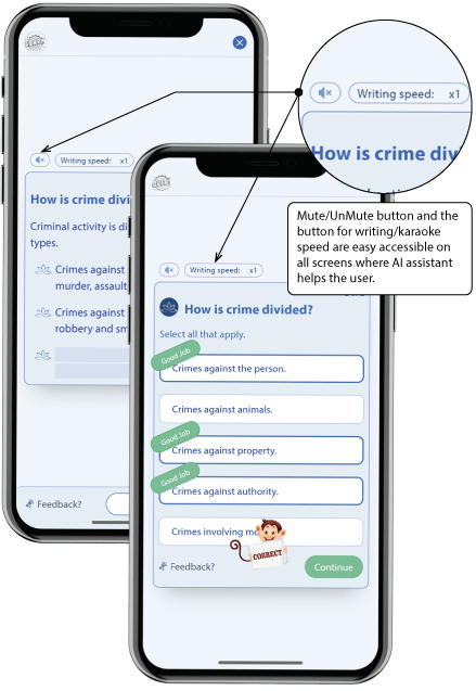
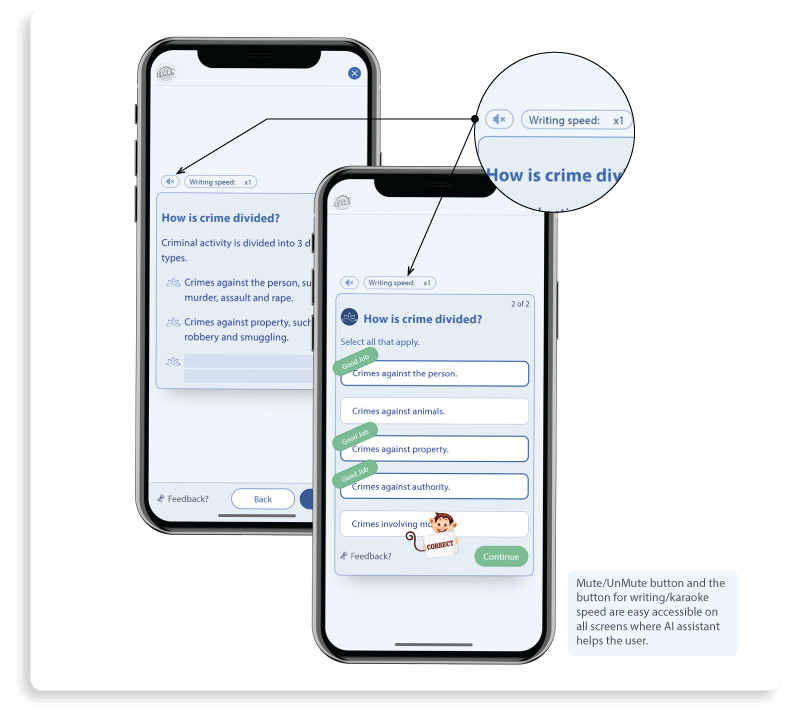
The solution here was to make the mute/unmute button always accessible, in all features where we use an AI assistant. Even on phone, where the user can use the hardware sound button, we decided to have a mute button accessible, consistent between all screens and device resolution.
Also, we gave the user an option to change voice/typing speed or turn it off, so we built it on all screens where AI assistant applies. This gives the students to learn slowly or quickly to repeat the lesson.
An important decision was that we remember the user’s choice and next time when he starts the app, we keep the same settings for the AI assistant - for mute/unmute state and for karaoke speed.
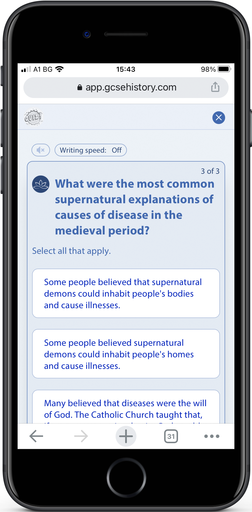
Learn and Quiz - mobile approach
Learn and Quiz is meant to be used mainly by students. This means that the main usage can be on phone. Both, learn and quiz, are very similar in functionality and flow.
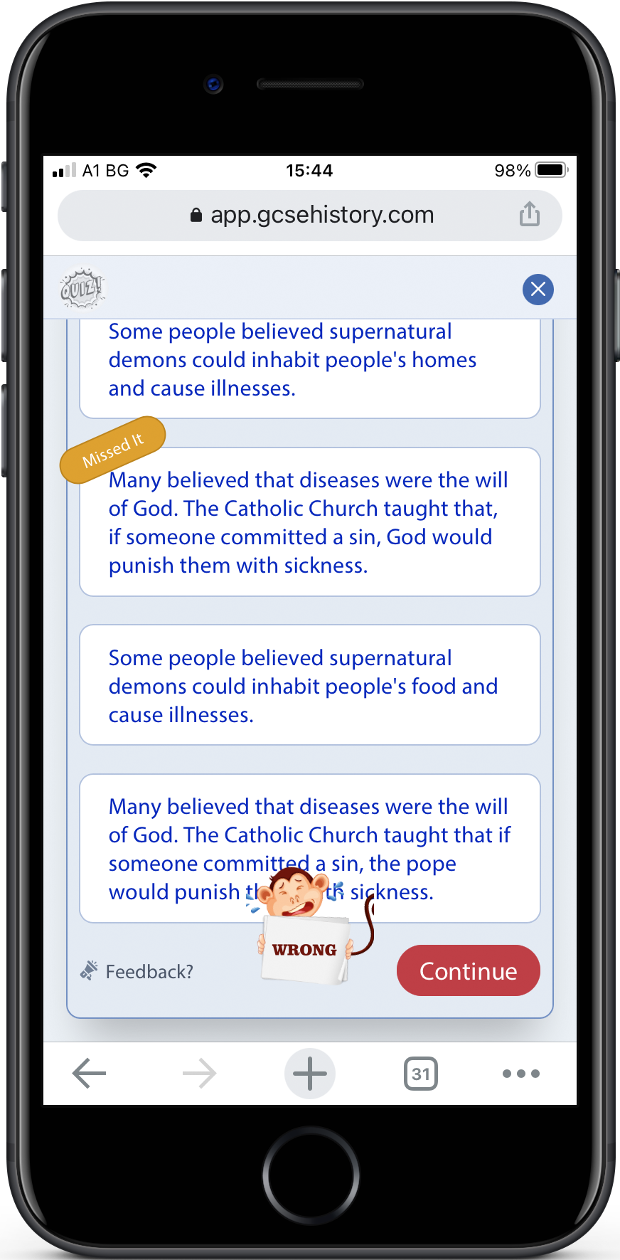
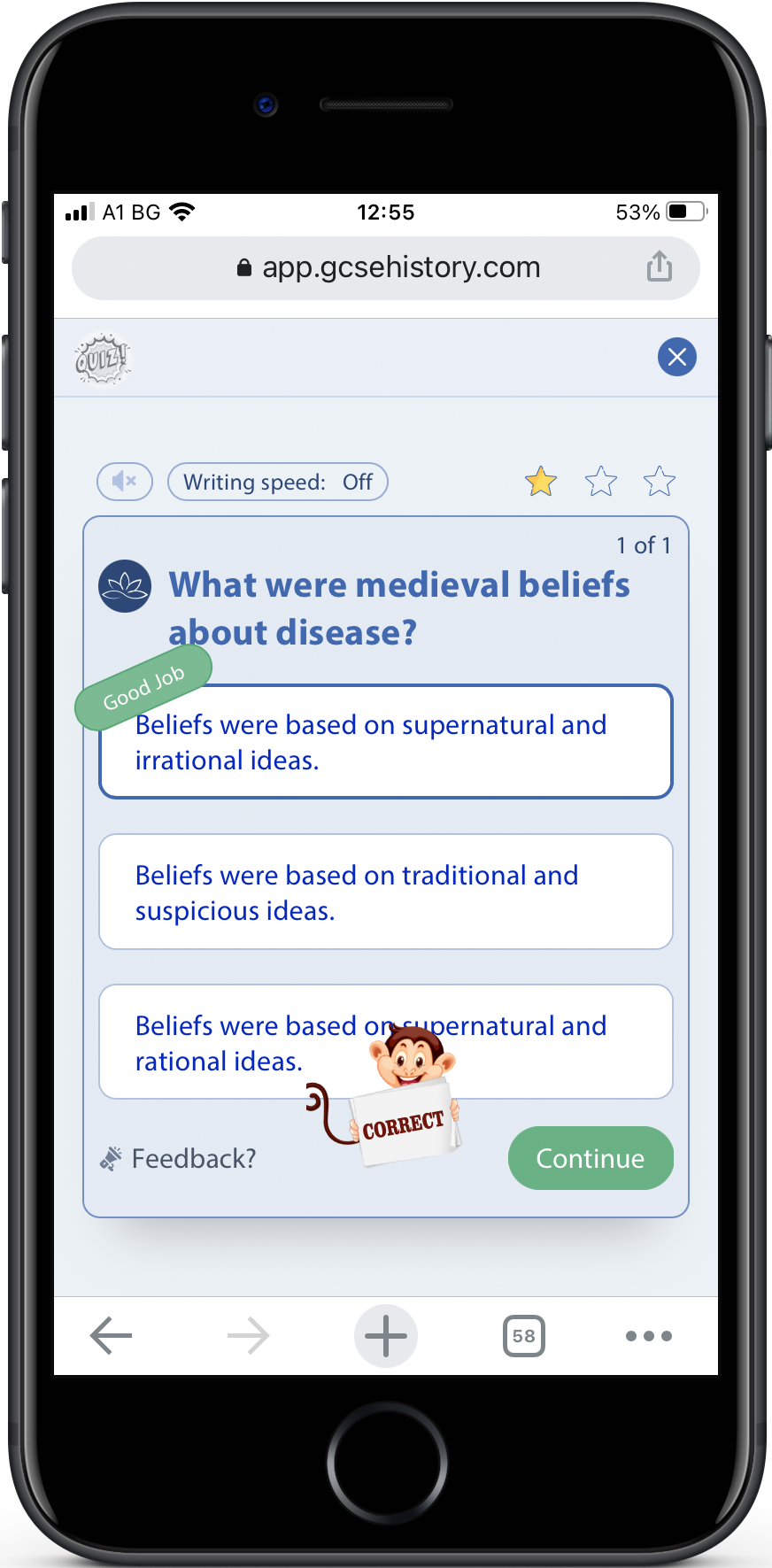
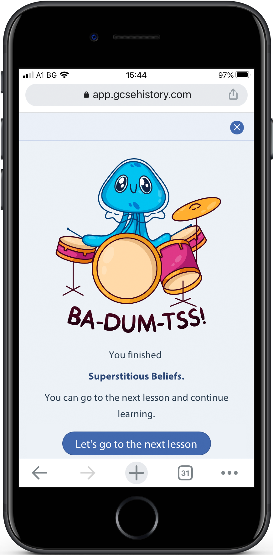
The user can learn or test himself with a quiz. In Learn, every lesson is split into a few main points and we show one main point at a time. Every quiz is split into multiple questions and we show one question at a time. But there are some fundamental differences between learning and quiz.
When learning, the user can navigate to the next point or go back. In the quiz, the user can go only to the next question.
On a mobile device, in the quiz feature, the student has to read all answers to the question, to make his choice by selecting the right answer and then click Next. This means we force him to read and not skip answers and just then he can click on the Next button. This was possible by making the Next button at the bottom of the screen, but scrollable with the content.
Learning is the opposite. When the student learns, we don’t show all the information right away. If the learning step includes one paragraph we show all the information, but if there are bullet points, we show one at a time, so the user can focus on one bullet. We show how many bullets are there with a placeholder. To see the next bullet, the user can click on the bullet placeholder or click on the Reveal button.
At first, we released this feature with only the Reveal button to show the next bullet point. Later, after discussion with students and teachers, we figured out that everybody was trying to click on the bullet point placeholder, to see the next bullet text. Our solution was to make a click on the placeholder to have the same functionality as a Reveal button.
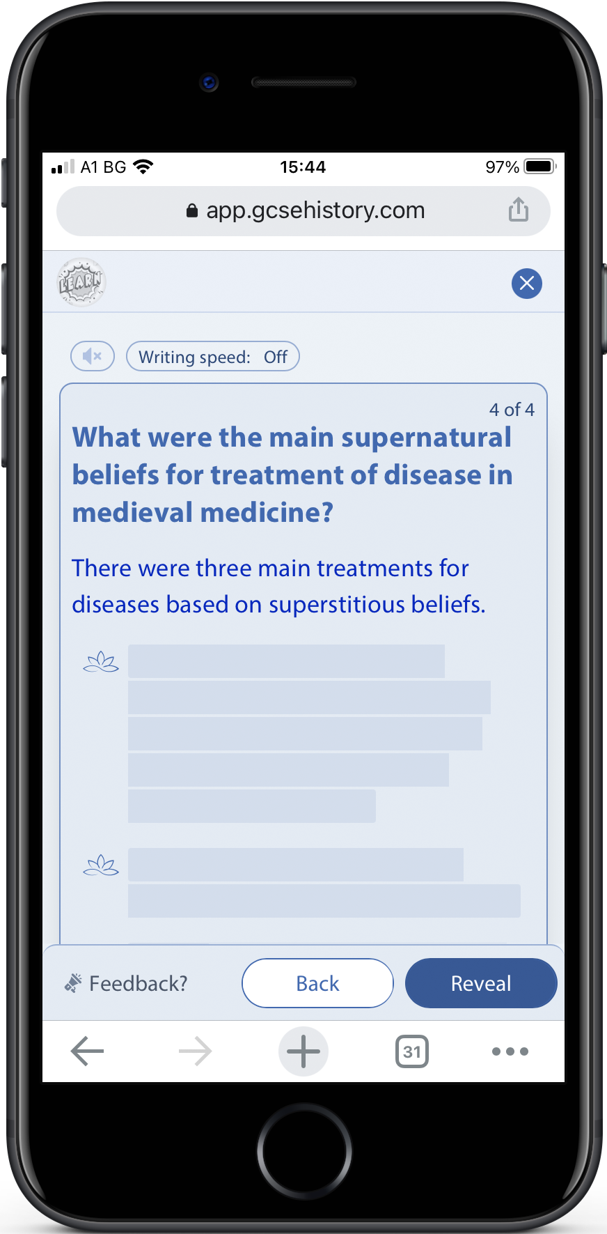
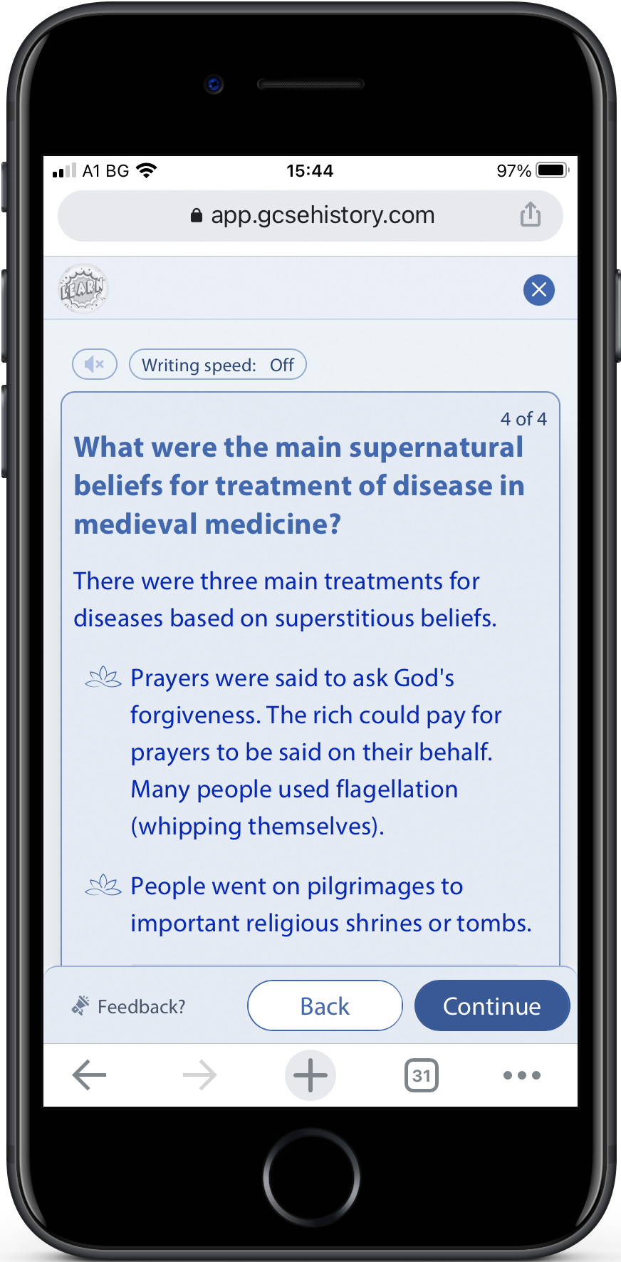
The difference between learning and quiz is that in learn we have a fixed bottom bar with buttons. In the learning process, the user needs this button always visible. If the learning content is long and the user needs to scroll, he sees the main buttons, because they are fixed. Buttons don't scroll with the content.
In Learn, there are buttons for Reveal/Continue and a button for the previous learning step. Reveal and Continue is the same button. It just changes the label based on the state. If there are bullets to reveal, we show the Reveal button. If the user reveals all the bullet points and he can move to the next step, we show the Continue button.
We considered also an option when the main buttons could be at the top of the mobile screen, as toolbar buttons, but we did it at the bottom, so it’s close to the user’s finger on mobile devices.
Another case we have was with hidden bullet points. If the user has scrolled and the next possible to reveal bullet point is hidden, then if the user clicks on the Reveal button, we scroll the content, so the hidden bullet point moves above the fold and becomes visible.
Responsive design
The entire website is built for mobile and desktop. Especially for the young generation, who spend most of the time on their phones, this is a must-have.
All interactions in all screens are adapted for both - mobile and desktop.
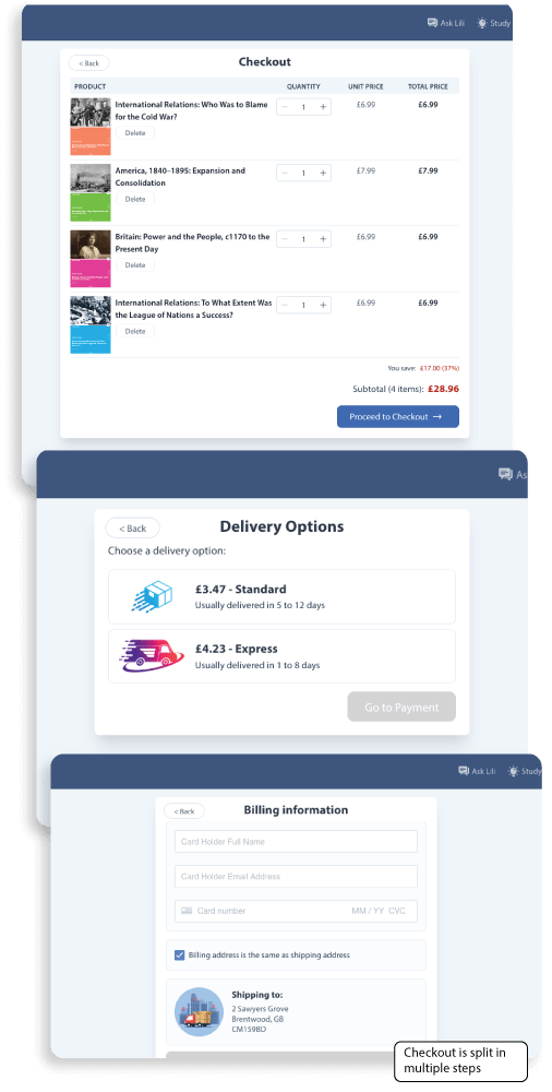
Bookstore
For our bookstore, we did research and analyzed other online stores, with big experience in online trading. We analyzed some of their decisions and adapted them to our business needs and the users' needs.
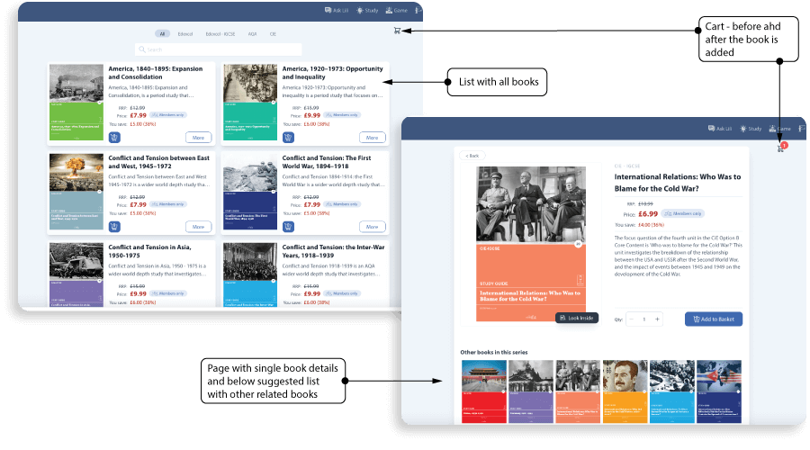
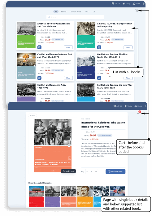
We split our Bookstore into 2 main flows. The first flow is also split into 2 screens. The first screen is where the user sees all books, can filter them, can search, can add them to the cart. In the second screen, the user can see details about the book and even can preview part of the content. We decided that on this screen we could show other books from the same series. This can encourage the user to add more books to the cart because they are related.
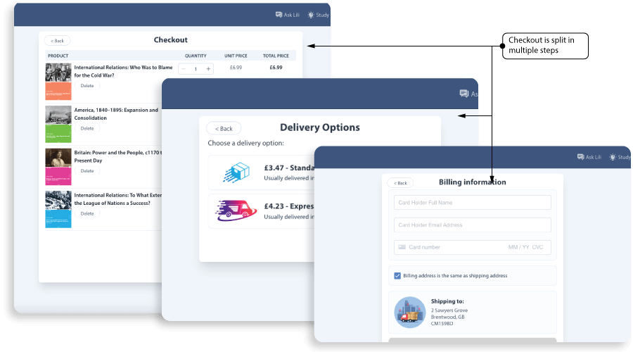
The second flow is when the user goes to the cart. After the user adds books, he needs to move to the cart section, which is made as a wizard, where he will be guided through the payment and delivery section. Each of these steps might be complicated for some users, so we tried to make it as easy as possible. This makes more steps for the user, with less confusion.
Books Design
Apart from the web and mobile apps, I also worked on graphic design for books and converting them to HTML layouts.
I designed front and back covers, and also inner pages for all 44 books.
My goal was to make the design look consistent between books, with some small, but important differences. If you see all books together, you can notice one big series of books, with common design, and at the same time easy to distinguish one book from the other.
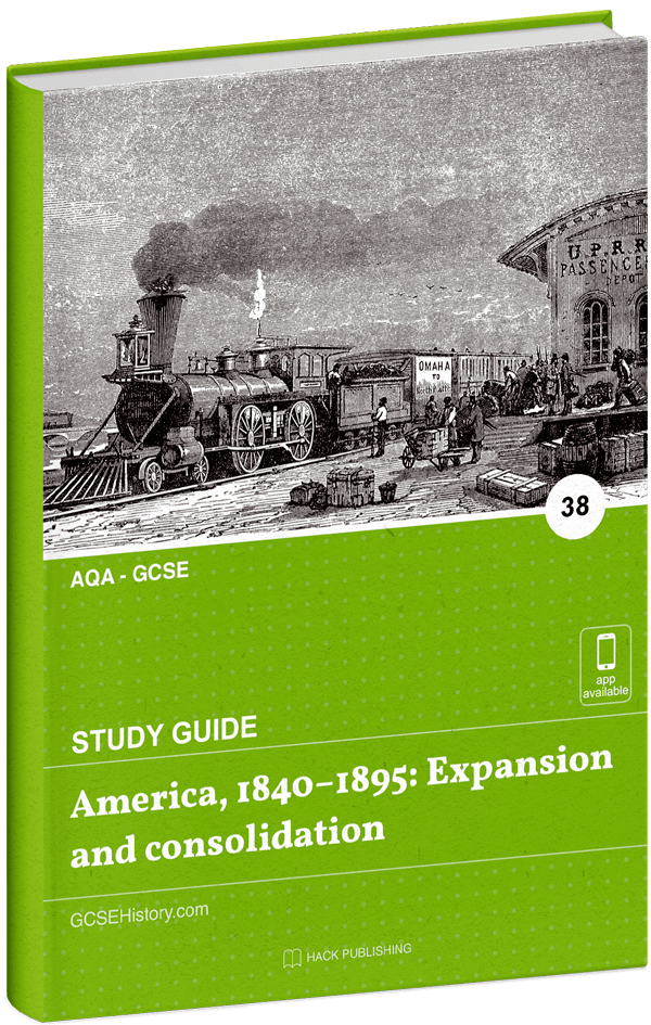
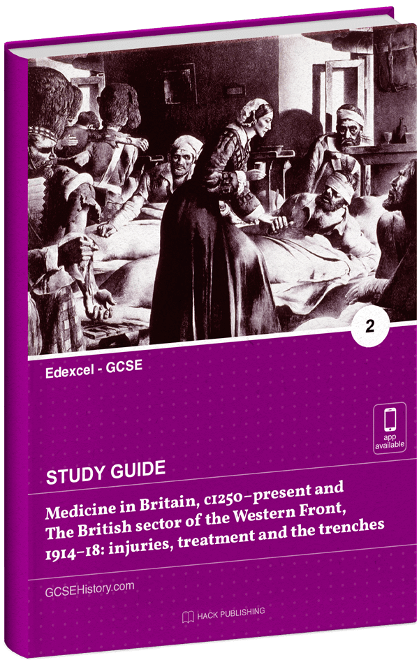
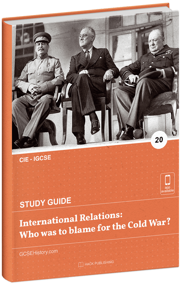
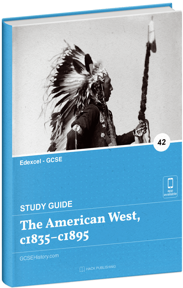
Each book is unique with specific cover color and cover photo image, related to the book content. Each book chapter starts with an icon, which is unique per book and is related to the book's subject.
After the design was finalized and approved, I started to work on reproducing the design with HTML and CSS. From the created layouts we generated books in PDF, EPUB, and Kindle formats.
Results
We gained a lot of new users for a short time. The web app was launched (09.2020). In the first 3 months, the newly registered users were 2500+ from more than 10 different countries. The main users were from the UK, but also a lot of registrations came from Singapore, Thailand, Hong Kong, Canada, the USA, etc.
What did I learn?
"Keep learning" is my motto. I am happy when in each project I learn new things. In this project, there were a lot of challenges and a lot of new things I learned. I improved my skills in designing user experience for different user groups, designing a complicated app. The biggest challenge was to look simple and easy to use at the same time. The new thing for me was designing a learning platform.
I helped the app to be easy for navigation and user-friendly. I did more research and analysis.
One interesting thing for me was working on native apps and to learn more about Human Interface Guidelines by Apple and Material Design Guidelines by Google.
I gained a lot of new knowledge, working with completely new technologies (Vue, Nuxt, Swift, Kotlin, etc).
Also, I gained more knowledge of JavaScript.
In this project, for the first time, I started using the Grid property in CSS and Conversational UI.